Dynamic form ⚡
You can embed or create a pop-out to capture any user input with the 'dynamic form' widget
Contents
Walkthrough guide
Form elements:
- Text
- Parameters
- Textarea
- Parameters
- Select
- Parameters
- Checkbox
- Parameters
Walkthrough guide
Form elements:
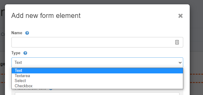
Text
Parameters
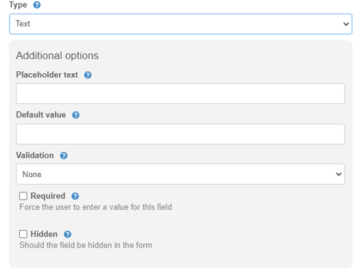
This is a simple text field with few parameters:
| Name | This will display to your users as the title of this input |
| Placeholder text | This will display greyed-out text as an example of what your users should enter |
| Default value | This will enter a default value that your user can change |
| Validation | will allow any text by default but can be set to allow only numbers or email address |
| Required | if this is a mandatory field |
Textarea
Parameters
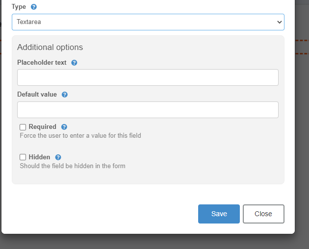
| Name | This will display to your users as the title of this input |
| Placeholder text | This will display greyed-out text as an example of what your users should enter |
| Default value | This will enter a default value that your user can change |
| Required | Select this option if this is a mandatory field |
| Hidden | This will hide the field from the user |
Select
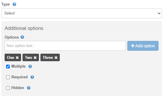
Parameters
| Name | This will display to your users as the title of this input |
| Options | This is where you create the options to display to your users |
| Multiple | This will enter a default value that your user can change |
| Required | Select this option if this is a mandatory field |
| Hidden | This will hide the field from the user |
Checkbox
Parameters
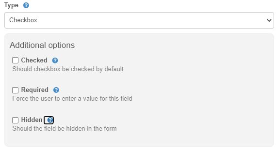
| Name | This will display to your users as the title of this input |
| Checked | This will set the checkbox to be ticked by default. The user can still change this |
| Required | Select this option if this is a mandatory field |
| Hidden | This will hide the field from the user |
